HIHAF, Re-imagined
One of the most rewarding projects I've done to-date
In 2011, I was honored to be asked to serve on the board of the Hawaii Island HIV/AIDS Foundation on the Big Island. It was my first time volunteering for a nonprofit, and it was a time of transition for the organization.I was eager to offer my skills and expertise to benefit HIHAF (‘HI-haf’ as it’s affectionately known). I began working on a brand refresh after the signature annual fundraiser — Taste of Life — concluded in August, and unveiled my work to the board and staff in November. It was a bold move; many organizations resist change. But I worked hard to stay true to the values of HIHAF while embracing the symbol bestowed upon it by a local supporter, the ho‘okupu (a special gift in Hawaiian culture), and it was enthusiastically accepted.
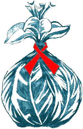
Legacy logo
Legacy
HIHAF adopted the ho‘okupu logo sometime in the early 2000s. Before that, they’d used a generic AIDS ribbon. The ho‘okupu holds special meaning, particularly for an agency focused on health issues surrounding HIV. The ho‘okupu is a Hawaiian ceremonial gift given as a sign of honor and respect. It is a symbol of HIHAF’s commitment to provide the best available services and resources to anyone who needs them.
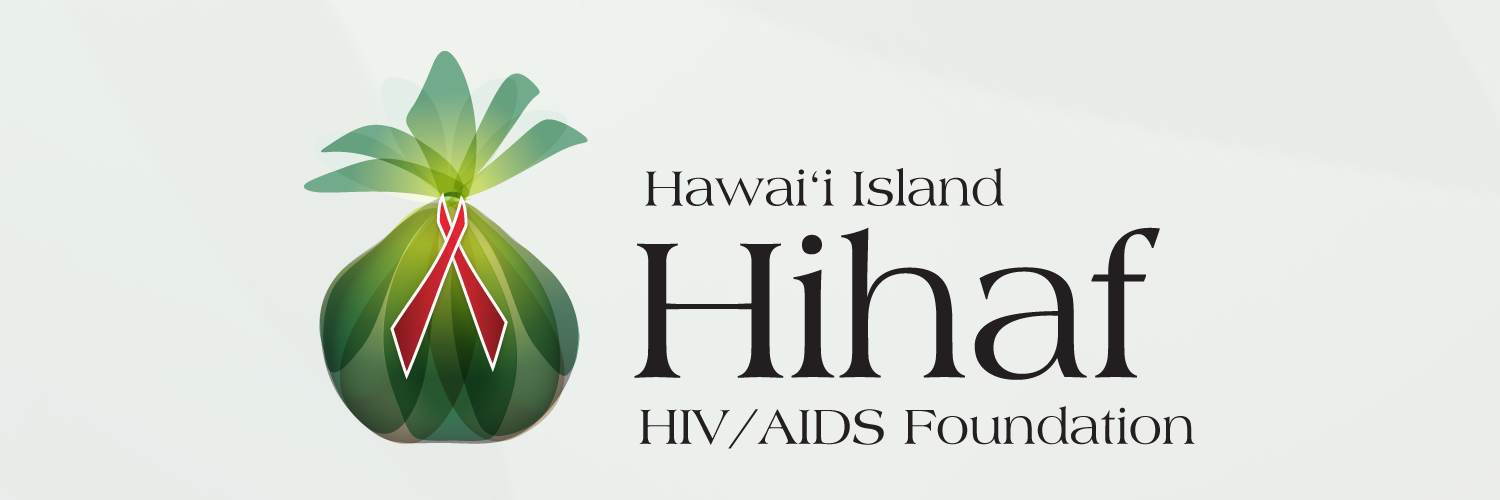
Once I learned about the history of the ho‘okupu, I knew it exhibited the essence of HIHAF. I would re-imagine the logo, giving it a modern take. The ho‘okupu symbolizes life, and I wanted that to come through in my work. The new logo would feature lush greens and glow with life from within, all cinched up with the iconic red ribbon.
The official name of the nonprofit — Hawaii Island HIV/AIDS Foundation — is descriptive. But for a brand, it’s far too verbose. Everyone in the community knew the agency as simply ‘HIHAF’. So the logo would emphasize this with a friendly logotype rendered as ‘Hihaf’ in Americana (though the text style would remain ‘HIHAF’).
Brand Refresh
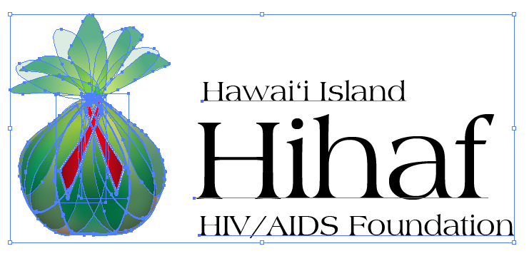
I spent hours and hours experimenting and tweaking to get the ho‘okupu just right — the shape, the colors, the blends.
I’d worked out the typography previously, and used the long form name with the legacy logo on the 2011 Taste of Life program. I adapted the logotype to emphasize ‘Hihaf’ to make the brand more endearing.
The legacy logo was a bitmap image, limiting its use and quality on various media. The new logo was made from scratch as a vector image in Adobe Illustrator.
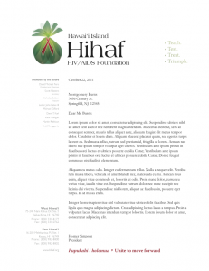
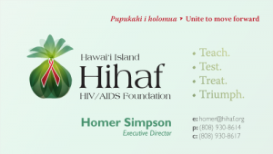
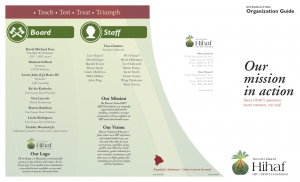
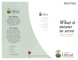
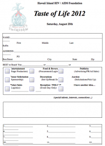
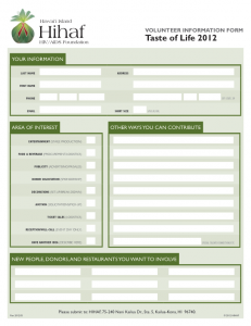
I went on to create a complete brand identity set, including stationery, brochures, signage, forms, and advertisements.
I used Illustrator for the business cards, letterhead elements, and some ads; InDesign for the brochures, signage, and forms; and Photoshop to create bitmaps for the website, social media, etc.



Related Work

